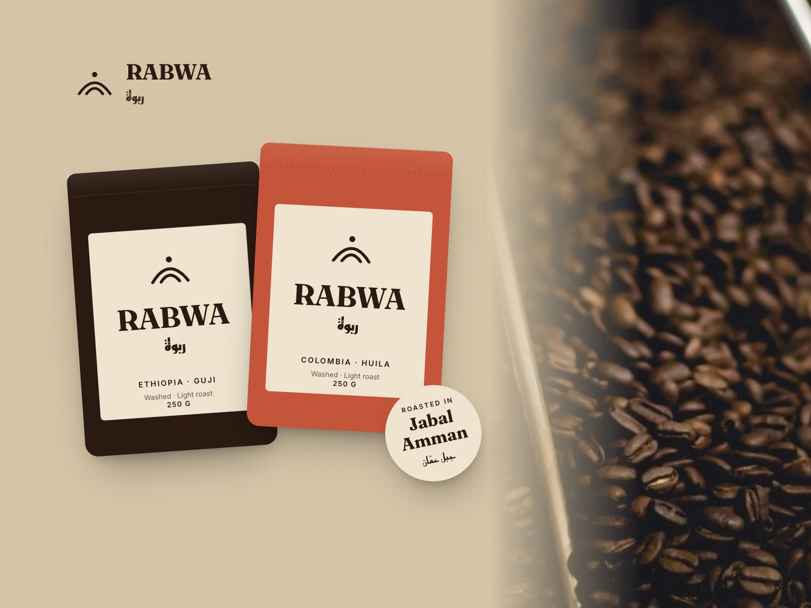
A roaster on Rainbow Street had outgrown its handwritten bags. We gave it a name people could say, a mark people remember and packaging that holds a shelf.
Rabwa had been roasting for four years under a founder's nickname, selling in brown paper bags labelled by hand. They were moving into supermarkets and opening two more cafés, and nobody outside Jabal Amman could find them twice.
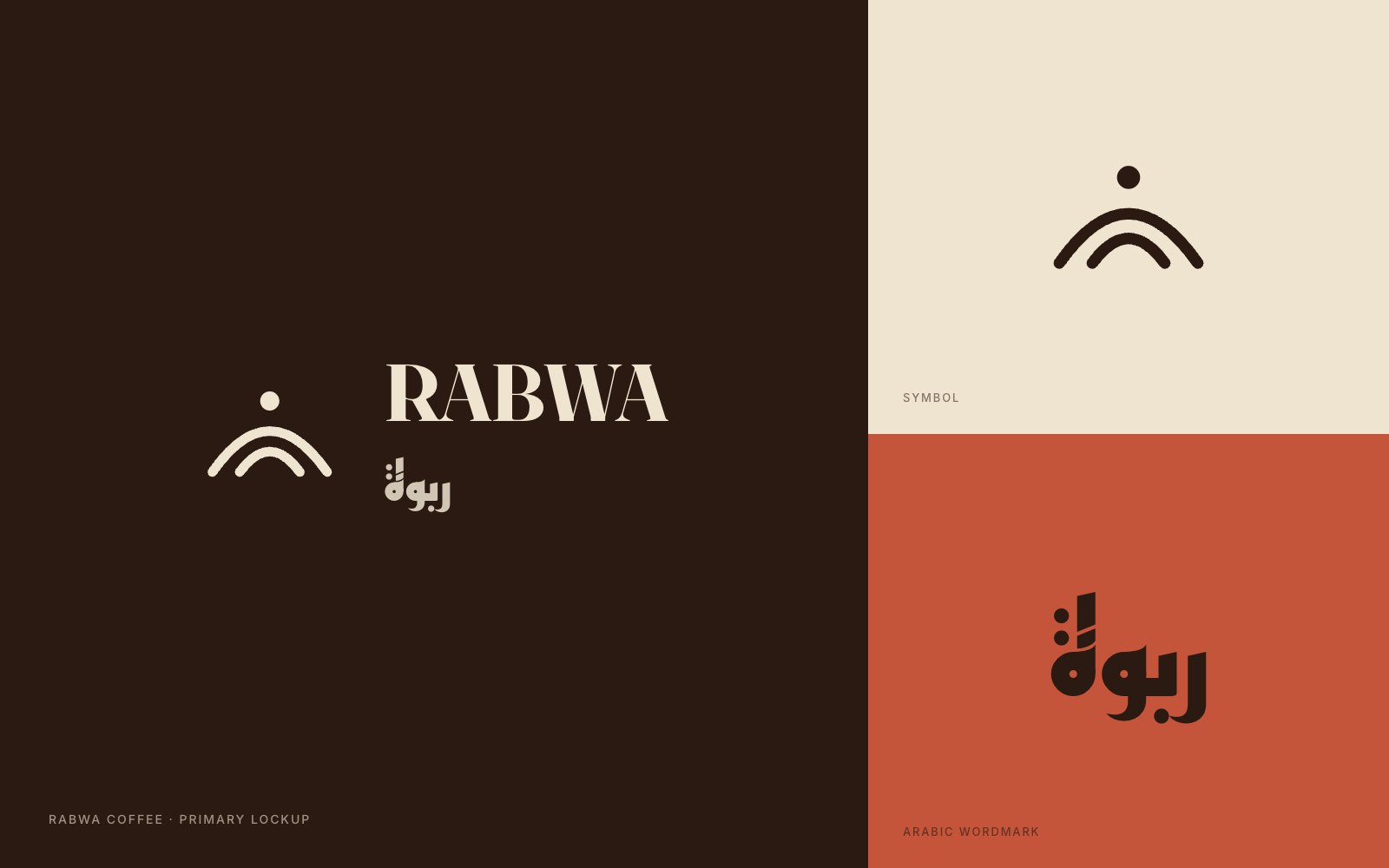
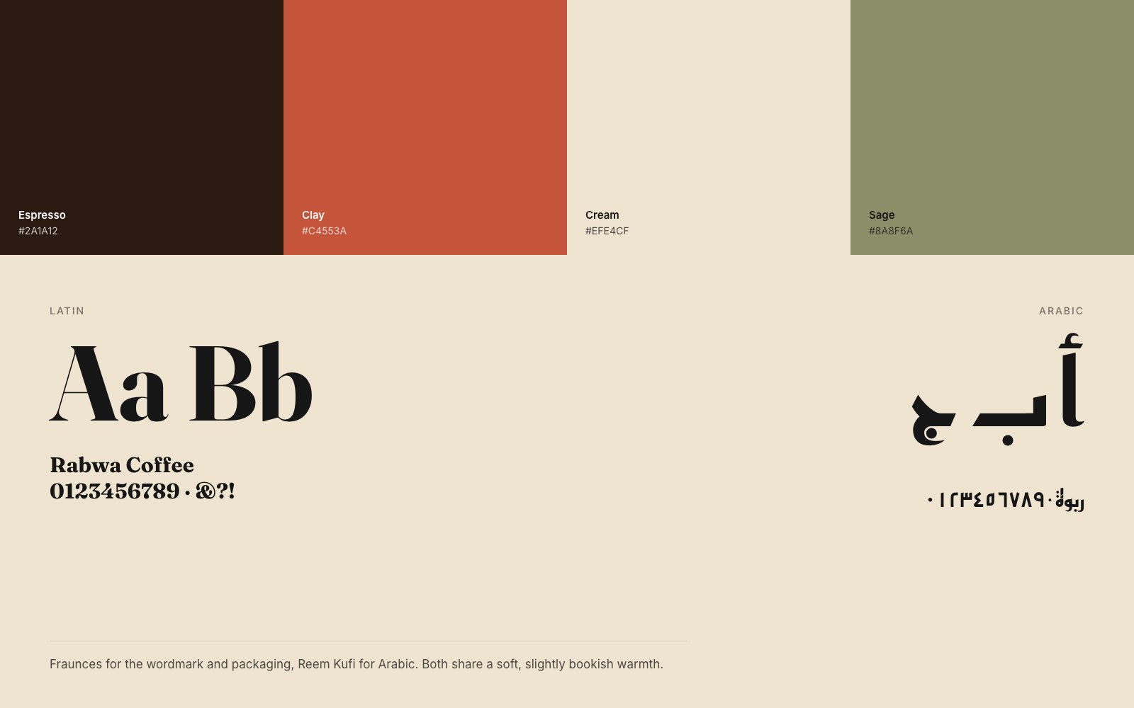
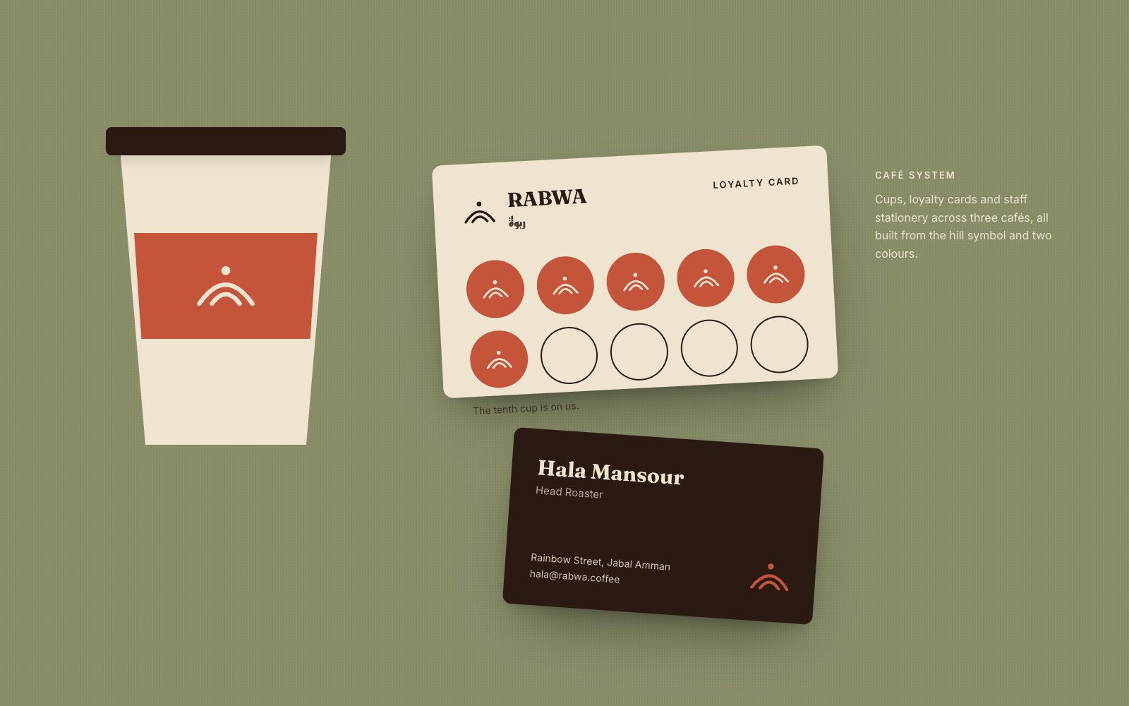
We kept the name and gave it a meaning: rabwa is a hill, and Amman is a city of hills. The symbol is two ridges and a rising sun, drawn to work at 12 millimetres on a sticker and three metres on a café wall. Fraunces carries the Latin, Reem Kufi the Arabic, and each origin gets its own bag colour so the shelf does the explaining.
“People used to ask for "the coffee with the brown bag". Now they ask for Rabwa.”
Hala Mansour, founder and head roaster